Version 7: SharePoint Template Gallery, Site Pages Folder Structure and Enhancements Galore
Sprocket Version 7.0 is here, and it fundamentally changes how SharePoint sites can be built.
What used to take weeks or months can now happen in minutes.
This release introduces a brand-new Template Gallery, major UX improvements across multiple web parts, and a new design philosophy: every web part should be useful from the moment it's added to the page.
Here are the headline updates.
New: Template Gallery. Build SharePoint Sites in Minutes
Organizations often spend hundreds of hours building SharePoint knowledge bases, intranets, and wiki sites from scratch (even though these solutions have already been perfected elsewhere).
The new Template Gallery solves this problem.
Based on years of experience implementing SharePoint across hundreds of organizations, Sprocket now provides ready-to-deploy templates that allow professional sites to be created in minutes.
From the Sprocket Actions menu, users can now select Apply Template and choose from a gallery of prebuilt templates.
Applying a template automatically provisions:
- Fully configured pages
- Complete navigation structures
- Document libraries
- Glossary lists with custom fields
- Images and assets
- Preconfigured web parts
For example, the IT Knowledge Base template provisions 16 pages and a full site structure in around 90 seconds. Something that would normally take a week to build manually.
Templates can also be explored at SharePointTemplates.com, a public resource showcasing the full template library, including knowledge bases, corporate wikis, and project sites.
Each template is designed for a specific SharePoint site type, so communication site templates must be applied to communication sites and team site templates to team sites.

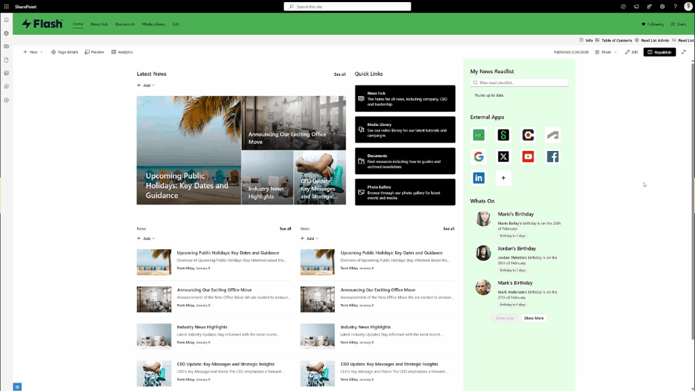
New: Page Feedback Web Part
The new Page Feedback web part gives site owners full control over where feedback appears on a page.
Previously, feedback was fixed to the bottom of the page using the five-star review system. Now, the feedback component can be placed anywhere within the layout.
Users can:
- Submit ratings
- Leave comments
- Provide feedback directly from the page
All responses are stored in a SharePoint list, allowing site administrators to review and act on feedback easily.
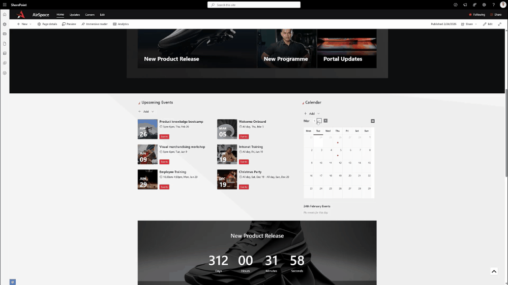
Improved: Calendar Web Part Redesign
The Calendar web part has been redesigned to work better in narrow columns and sidebar layouts.
This allows teams to include a quick "at-a-glance" calendar view on homepages or department sites without consuming too much screen space.
New improvements include:
- Optimized display for narrow layouts
- Event indicators using theme-colored dots
- Clickable dates to view events
- Category-based color coding
- Default filter settings
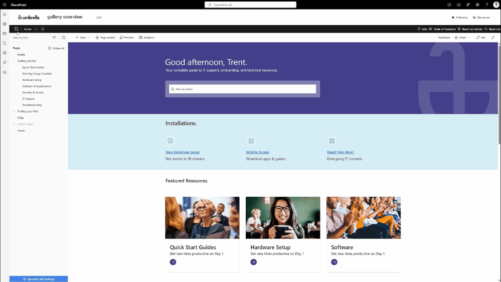
New: Collapsible Navigation Panel
Version 7 introduces the ability to collapse the left-hand navigation panel.
Users can hide the navigation to focus on page content and regain screen space.
When collapsed:
- Hovering over the panel temporarily reveals the menu
- Clicking the toggle pins the menu open again
The system remembers whichever setting the user chooses.
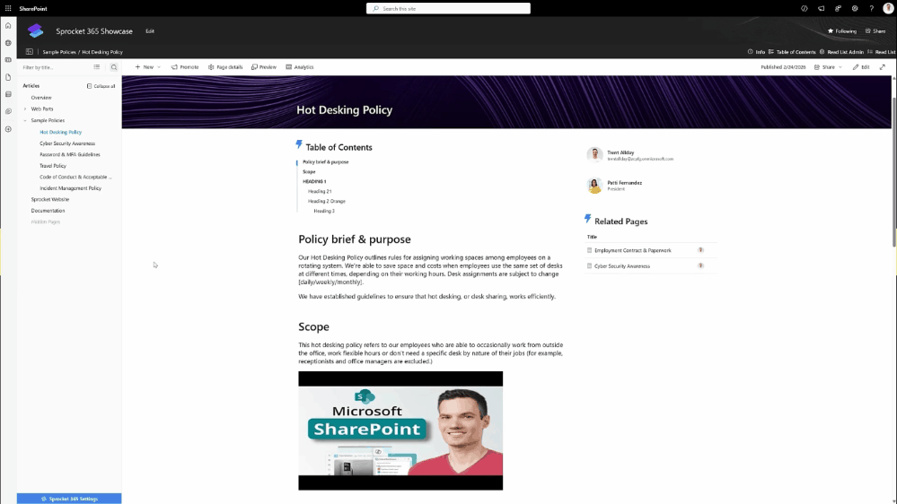
New: Site Pages Folder Structure Navigation
A new Site Pages folder structure navigation mode is now available for Knowledge Hub.
Some organizations prefer organizing pages using the Site Pages library folder structure instead of manually ordering pages through navigation.
This feature can be enabled in Sprocket Settings → Knowledge Hub → Navigation Source.
When enabled:
- The Knowledge Hub tree reflects the actual folder structure in the Site Pages library
- Pages can be dragged into folders directly
- Clicking Save moves the pages into the corresponding SharePoint folders
This allows administrators to manage navigation using the same structure as the underlying SharePoint library.
Improved: My Apps Web Part UX
The My Apps web part has received a major UX refresh.
Enhancements include:
- Option to hide labels for an icon-only layout
- Choice between square or rounded icons
- Improved drag-and-drop behavior
- Updated icon language for adding and removing apps
- Padlock icons for mandatory apps
These updates make the web part more flexible and visually consistent.
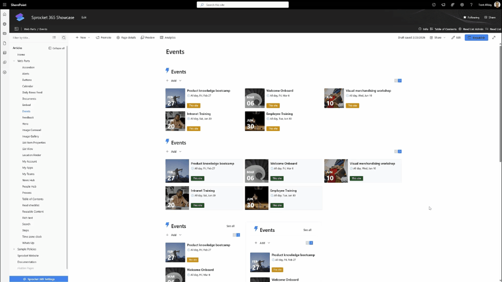
Improved: Events and Daily News Web Parts
Both the Events and Daily News web parts now offer more layout options and improved performance.
Events Web Part
New features include:
- Support for wide column layouts
- Block style layout in addition to list view
- Maximum items per page for better performance
- Filtering options for controlling which events appear
Daily News Web Part
The Daily News web part now offers multiple display styles:
- Top News layout
- List layout
- Card carousel layout
Additional improvements include:
- Pagination via Max items per page
- Filters for category, site source, and date range
A New Philosophy: Useful From the Moment You Add It
Version 7 introduces a new design philosophy for Sprocket:
Every web part should be useful the moment it's added to a page.
Instead of blank states requiring configuration before anything appears:
- People Hub now loads with sample data so users can immediately see how filtering, search, and org charts behave.
- Location Finder displays placeholder imagery and guidance even without a Google API key.
- News web parts automatically assume the current site as the source.
Where assumptions cannot be made, the system provides clear, friendly guidance instead of empty screens.
The goal is simple: help users become productive faster.
Additional Enhancements
Version 7 also includes:
- Pagination support for custom lists and documents
- Accessibility improvements to Read List
- Ability to open Related Pages links in new tabs
- Numerous bug fixes and refinements
For the full list of updates, refer to the complete release notes.